The Great Acceleration
Since 1950, human activity has entered a fundamentally different era of planetary impact. Population increase is seen to correspond to energy consumption. A similar curve appears in global GDP since the 1950s.
The pattern repeats across emission data, where an abrupt acceleration can be seen around the 1950s. There is a similar curve in the temperature measurement data across metrics.
This is not growth. This is acceleration towards overshoot, where the carrying capacity of the environment is exceeded. This is reflected not only in resource depletion levels but also in waste production and its resultant toxicity.
For the original Great Acceleration information and 24 graphs:
Steffen, W., et al. (2015). “The trajectory of the Anthropocene: The Great Acceleration.” The Anthropocene Review 2(1): 81-98.
The Geography of Extraction
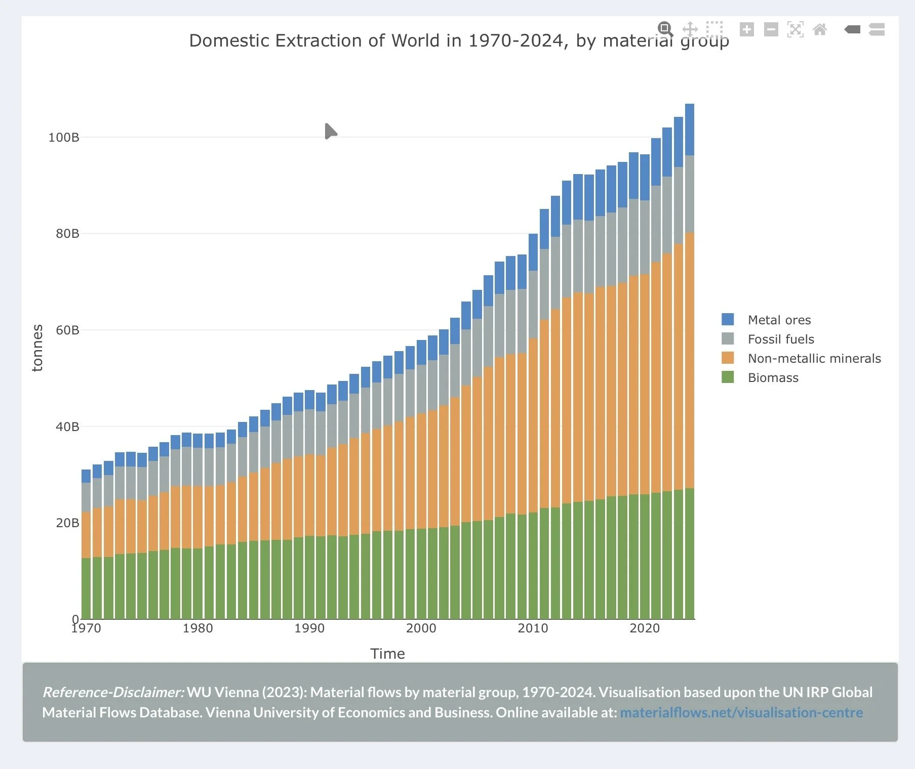
Domestic extraction of the world by material group shows absolute volume in tonnes, stacked by category. The takeaway is total throughput growing from ~20B to ~100B tonnes from 1970-2024.
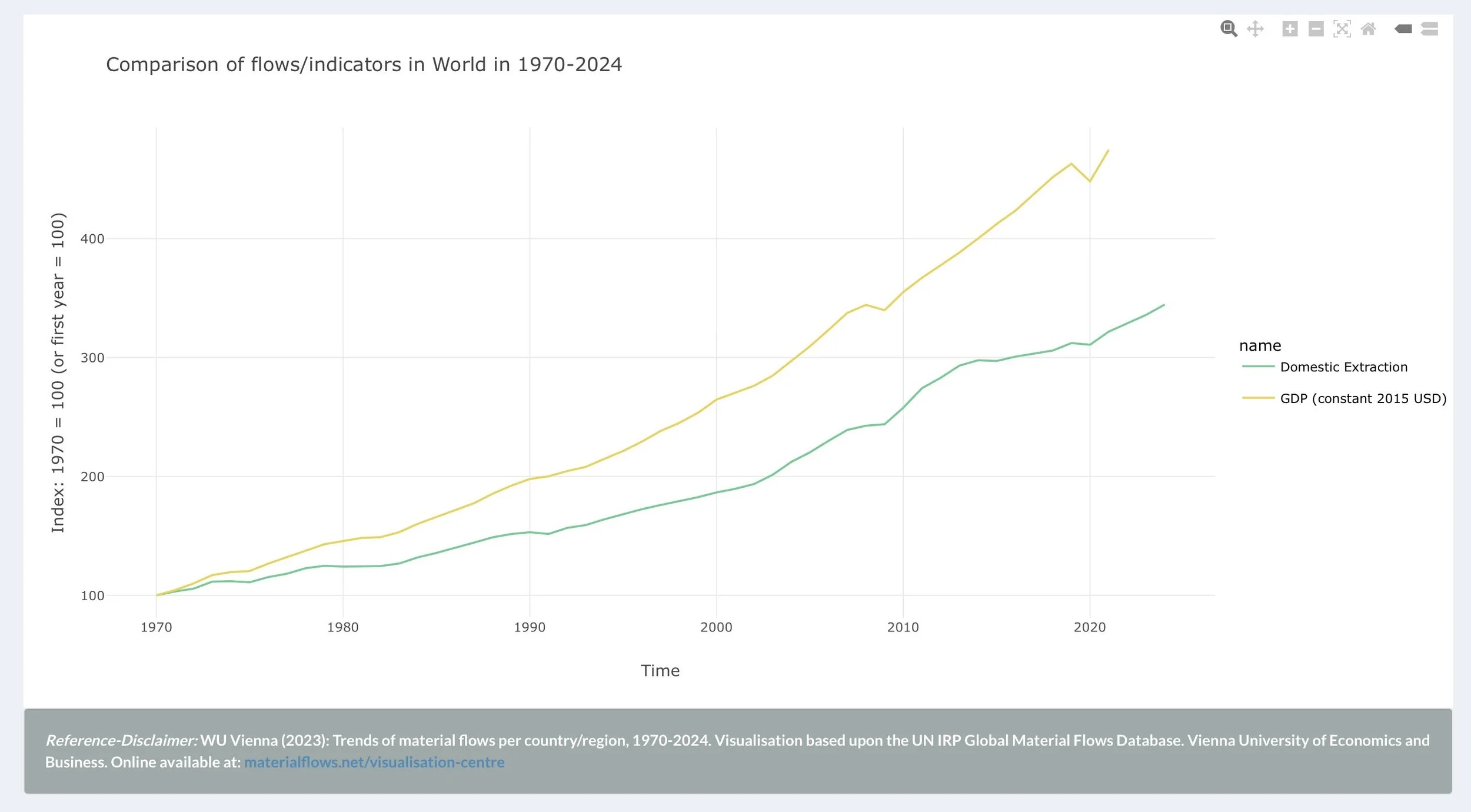
This chart indexes global GDP and total domestic material extraction from 1970-2020, allowing direct comparison of growth rates. While GDP has grown faster than material extraction, which is the basis of ‘green growth’ claims, extraction has nearly tripled in absolute terms. The economy has not decoupled from physical reality. It has simply generated more dollars per tonne extracted, while continuing to extract more tonnes every year. GDP grew faster through financialization and services that inflate monetary value without reducing physical throughput.
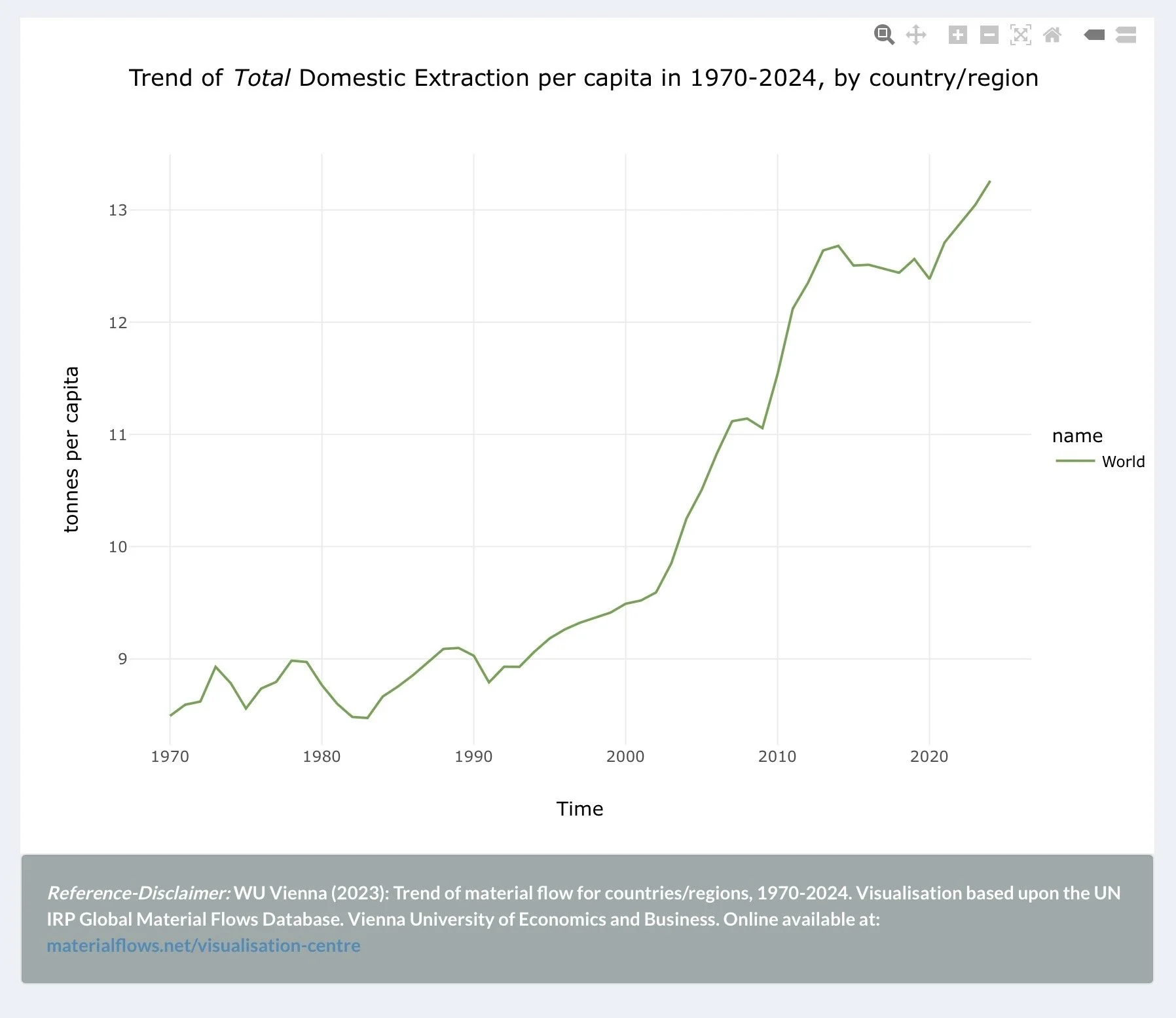
Total domestic Extraction per capita by country/region shows per-person intensity overtime for different regions. The World line rising steadily means extraction is growing faster than population, not just proportionally. Ie, per capita consumption rate is increasing.
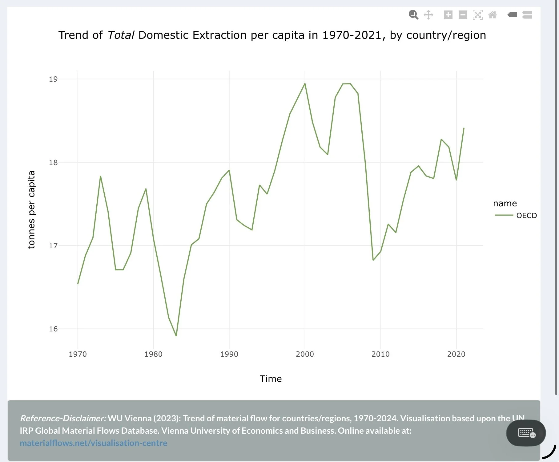
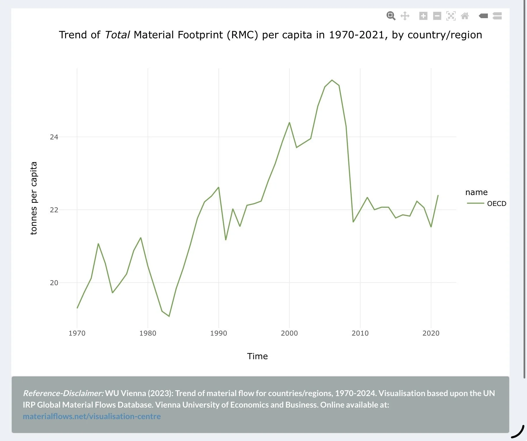
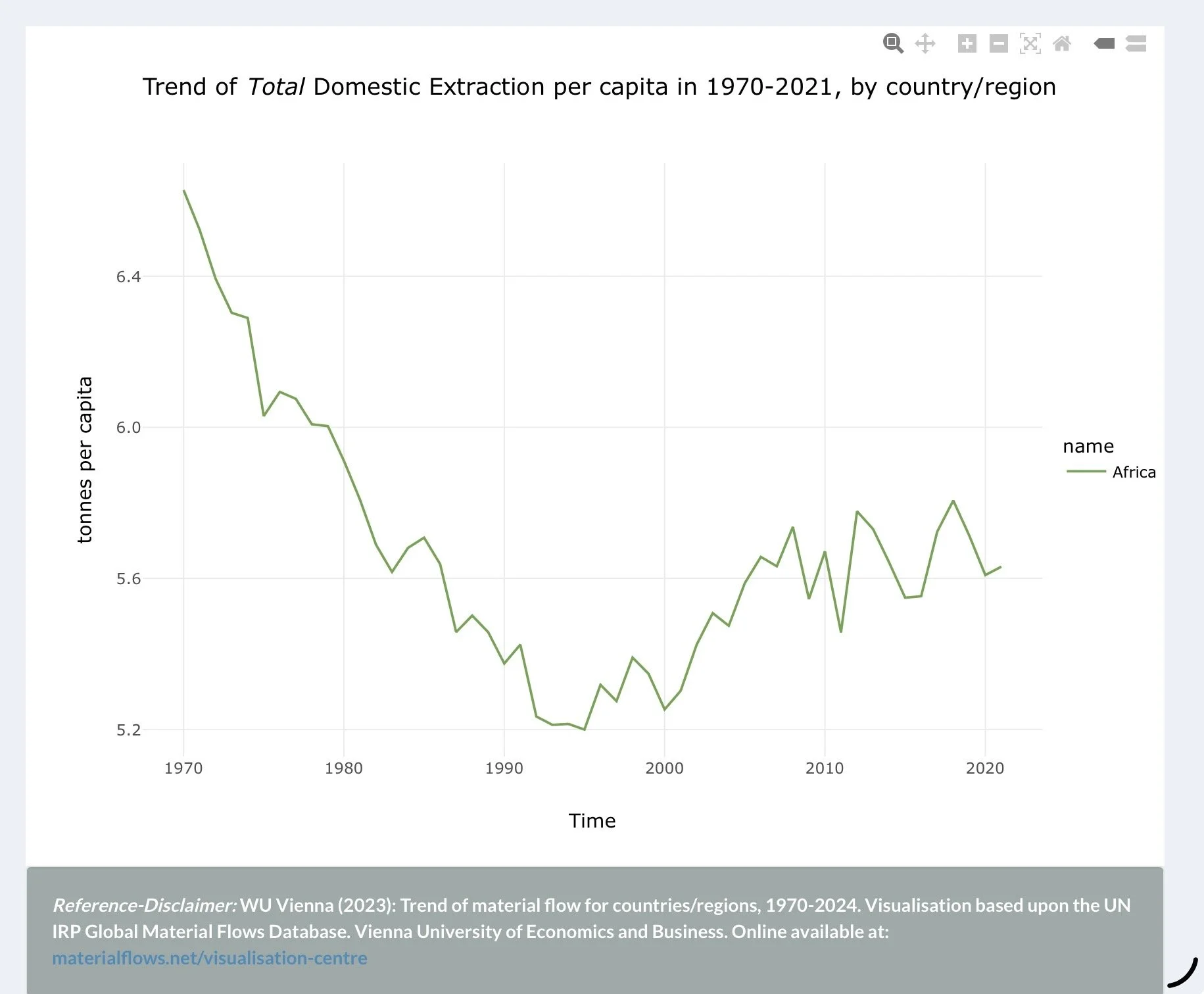
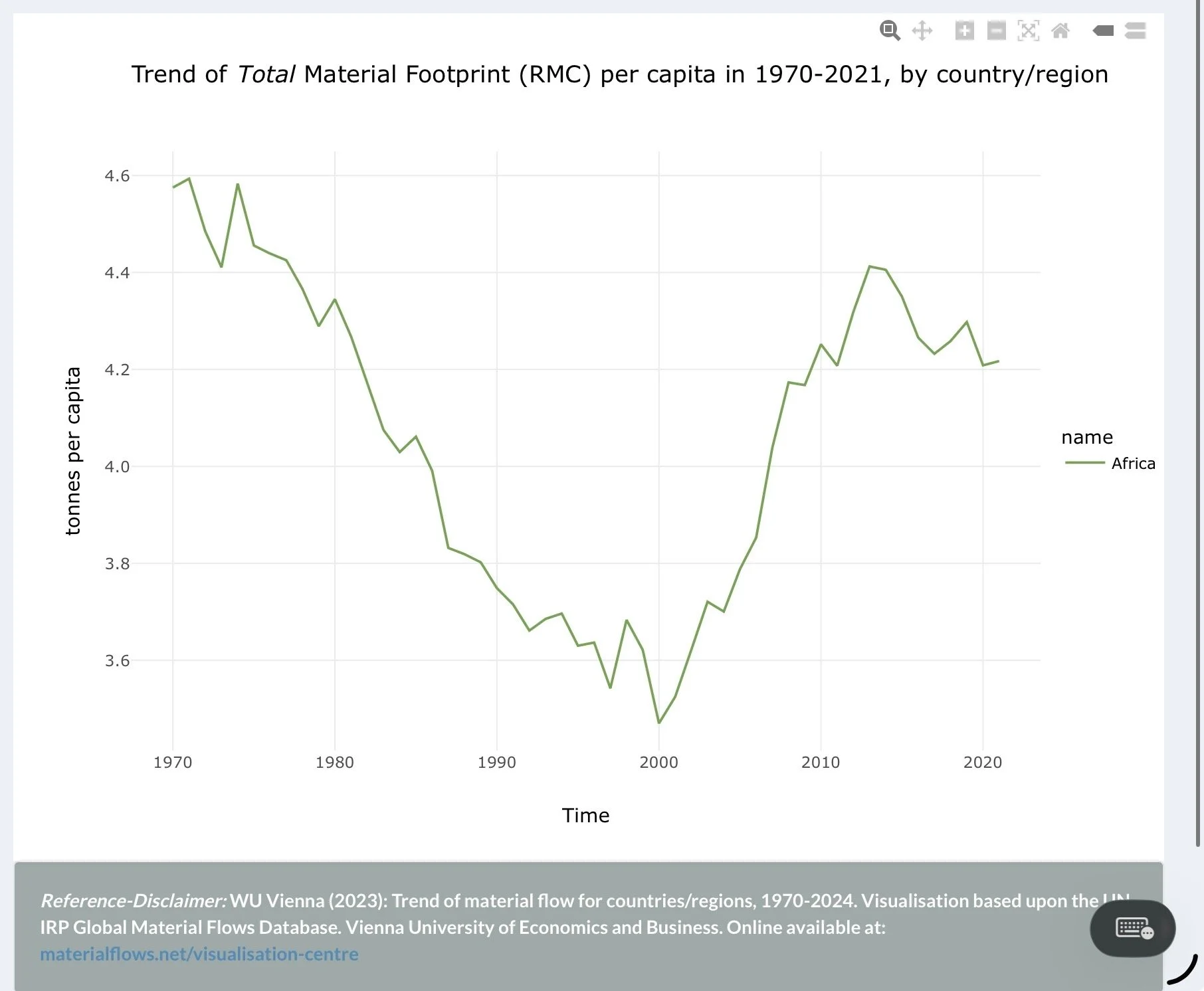
These charts compare two different ways of measuring material consumption per capita, for the OECD nations (Organisation for Economic Co-operation and Development - 38 countries are members and represent a section of high wealth countries) and Africa separately to designate one example of a lower wealth country.
Domestic Extraction measures what is physically pulled from the ground within a region’s own borders - mining, harvesting, drilling. It captures what a place produces materially.
Material Footprint (RMC - Raw Material Consumption) measures all the materials required to produce everything a population actually consumes, regardless of where extraction occurred. It follows goods back through supply chains to their raw material origins.
The gap between these two numbers is the hidden material cost of trade.
OECD nations show a persistently high Material Footprint - 20 to 24 tonnes per person - that has not meaningfully declined despite efficiency gains. Their Domestic Extraction is somewhat lower, meaning a substantial portion of their material consumption is outsourced to other regions.
Africa’s Domestic Extraction is higher than its Material Footprint, the inverse pattern. The region extracts more than it consumes, exporting the material burden of wealthier economies while its own per capita consumption remains a fraction of OECD levels.
Read together, these charts show that global material throughput is not an abstract aggregate problem. It has a geography, and that geography follows existing economic hierarchies
This is the refutation to the idea of “relative GDP coupling” seen in the USA underlying the growth argument. Global GDP is seen not to decouple and the relative decoupling is seen to relate to offshoring to poorer nations.